The technique the artist used was a free style drawing. This means the picture was not pre- draw before color was applied, but he drew directly with the color. This shows the artist's level confidence in drawing and painting. Not only that but also his ability think abstractly and present his thought made easier to make such a beautiful picture.

Saturday, May 11, 2013
The technique the artist used was a free style drawing. This means the picture was not pre- draw before color was applied, but he drew directly with the color. This shows the artist's level confidence in drawing and painting. Not only that but also his ability think abstractly and present his thought made easier to make such a beautiful picture.
Thursday, May 9, 2013
Blog Post Extra Credit
 |
Demonstration of Contrast
Demonstration of Harmony
|
 |
| Demonstration of Balance |
 |
Demonstration of Rhythm  Demonstration of Proportion |
Wednesday, May 8, 2013
Blog 7 An Interview
 |
| A portrait of Salomey |
She added that some people buy and export the artworks top France and Germany to resell them. Salomey made it clear that it was not only the money her brother was making , but his unique techniques his used.
Commenting on her own artwork, Salomey mentioned that all artworks must be mentally planned and executed before she actually makes the artwork. In other words, she starts her creative process in mind first. Additionally, she stated that she likes to draw still life, particularly objects in the environment. Furthermore, it was learned the she likes to draw with graphite and acrylic.
 |
| A paper towel on a holder |
Blog 8
To this far, I have learned a lot in ART 283 class. This class has given me the opportunity to learn different computer programs that are very interesting and important as well. The programs used in this class are Adobe Photoshop CS6, Illustrator CS6, After effect CS6 and Power Point Presentation. I must also say that this class has being my first digital computer graphic hands-on experience yet a lot have been learned.
It is also interesting to learn about the tools in the program. Whatever tool you need, it is a matter of making some clicks to get the work done. The magic tool, pencil tool, pen, not forgetting brush and blend tools are amazing.The way the programs are designed such that they will do the job for you.
Furthermore, digital art is found to be less time consuming compared to traditional art making, but one must be very proficient in using the program. For that matter, I will create time to able to practice using these programs in order to be familiar the programs.I like all the programs, but Photoshop seems to be the one I Iove.
Tuesday, April 30, 2013

Thursday, March 28, 2013
Blog 5. My Artworks Themes and interpretations
I like to make artwork under several themes and use unique
ideas to execute my work. My ideas are sometime different from common ones some
artists used. In general, all artworks fall under specific themes. I am
detailed oriented person and have time for every artwork I intent to make. I
usually like abstracts, sculpture (3D, carving) and landscape drawing and
paintings.
To me, abstract artwork makes people or viewers to think and
figure out what the piece they represent instead of seeing realistic
representation of the work. The three dimensional artwork has a lot to do to it
than two dimensional artwork. Since I like challenging task, three dimensional artworks
bring the challenge to me to overcome it.
I understand that
every artwork has some elements and the principle that brings out the aesthetic
of the artwork. Examples of these elements are dots, shapes, lines, textures,
color, etc. and the principles are balance, contrast, perspective, dominance,
variety, rhythm or movement, etc. I incorporate these principles and elements
in my artwork to achieve the desired piece of work.
Friday, February 22, 2013
Self-portrait Artists
 | ||
| Dr. Ablade Glover's Artworks
Dr. Glover trained in Ghana, Britain and the United States. Until 1994 he was Associate Professor and Head of the Department of Art Education and Dean of the College of Art at the University of Science and Technology, Kumasi,
Ghana.
 
Dr. Glover likes abstract paintings with oil on canvas. His paintings are mostly complex scenes and has clear themes or subjects which is depicted inthe picture. Such subjects as bus station, market place, landscape, beachscape, etc. Dr. Glover has an intense knowledge and unique style of painting. His oil paint application is thick and textured rather flat. I like his style.
|


James White's Artwoks


James is a computer artists. I like his choice of colors. He mainly employes warm and bright colors. His artworks are mostly in three dimensional and uses light and dark tone or shades to achieve his three dimenional effect. He incoperates action, movement, (rhythm)Balance dominance in colors tone and high degree of contrast. These principles of design is well used in most of his works. His of truth is: "My personal art and design ambitions have landed me in many worldwide creative publications such as Computer Arts magazine, Computer Arts Projects, Advanced Photoshop magazine, Wired UK and the spanish DT Platinum magazine where I was included in their ‘21 People of the Century’ article." James White rocks.

Bob Ross's Artworks


 |
| Bob Ross is famous in American art. I love his landscape paintings. He paints with natural touch. He is detail painter. His overall painting quality is his color application. He can use color effectively to create any atmosphere he desires. His artworks attracts the eye and as high aesthetics qualities. |
Thursday, February 21, 2013

Thursday, February 14, 2013

B log 3
The Artworks of FRANK DRAGON
from China ( The artist that I admire)

This painting shows an isolated house by the river side
surrendered by trees and mountains. Frank uses some techniques such as
perspective to create depth in the picture. It is evident that the sky and the
mountains seem to be far from the viewer. The nature of the trees suggest home
environment, peaceful and calm.
The back of the picture looks denser then the forefront
which gives solidity and stability to the picture. The darker color used for
the water show that the water settled, no movement is going on. It’s like lake
water. The atmosphere suggests cold weather and the plants getting enough water
to survive due the presence of the water.

This picture depicts natural river flowing down the valley.
Frank’s seems to represent cold winter weather. The water looks icy and snow
covering the trees. When one looks through the trees to the back, it gives that
sense coldness in the picture. His choice of colors helped him to achieve that
effect.
However, the color of the leaves also suggest a
certain season where all leaves turn yellow, Frank Dragon is from China. I am
not sure if season they such season china or not. I assume they have a weather
in which all leaves turn yellow. Overall
quality of the work is outstanding

This beautiful landscape painting was made by Frank Dragon
from China. Frank uses brighter colors in this paint work to depict a picture
of a day of an intense sunshine which seems natural and real. He again demonstrates color dominance of
yellow. This may be due to his idea of showing a sunny day.
Frank also employs the principle of perspective to create
depth in the picture. A smooth emerging of the land and the sky is successfully
achieved. The tones and shades are very outstanding. One can assume it was in evening when the sun
was ready to go to sleep. Good job done Mr. Dragon.
Wednesday, February 13, 2013
My Artworks
 |
| This artwork was made of graphate and charcoal on paper. This a still life drawing one of my Art class. The darkest tones charcoal and the other medium is graphate. After that it was sprayed with a fixative 2 |
 |
| This is also a project in Art 121 -drawing class. This artwork was made with graphate of all shades. HB, 2H, #6, #8.The darkers tones was made with #6 and #8 graphate pencil. |
3
 |
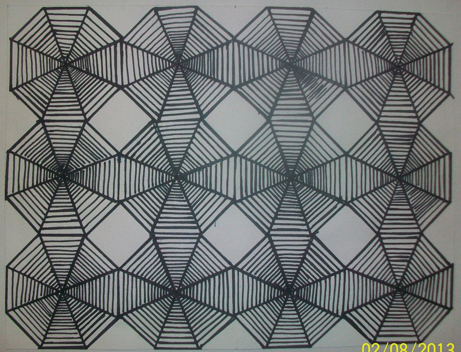
| This was made in my Art 131-design 1 class in spring 2013. the idea is to create intricate pattern design.
It was made in black ink pen (felt pen). It was created out a 8-sided polygon (hexagon). The principle perspective was employed to make a graded lines from the center-out of each hexagon to the to create the illusion of depth.
|
4
 |
| This was made in my Art 131-design 1 class in spring 2013. The idea is to create is to make a collage to create a scene of people or animats engaging in activities in an environment. |
 |
| Vehicle writing for a guy. |
6
 |
| An alter designed for a christian family |
7
 |
| This a custom pulpit designed for a church. It was made in wood and glass and leather on the very top. |
8

Friday, February 1, 2013
Subscribe to:
Posts (Atom)